Web development
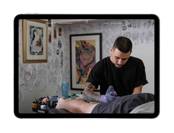
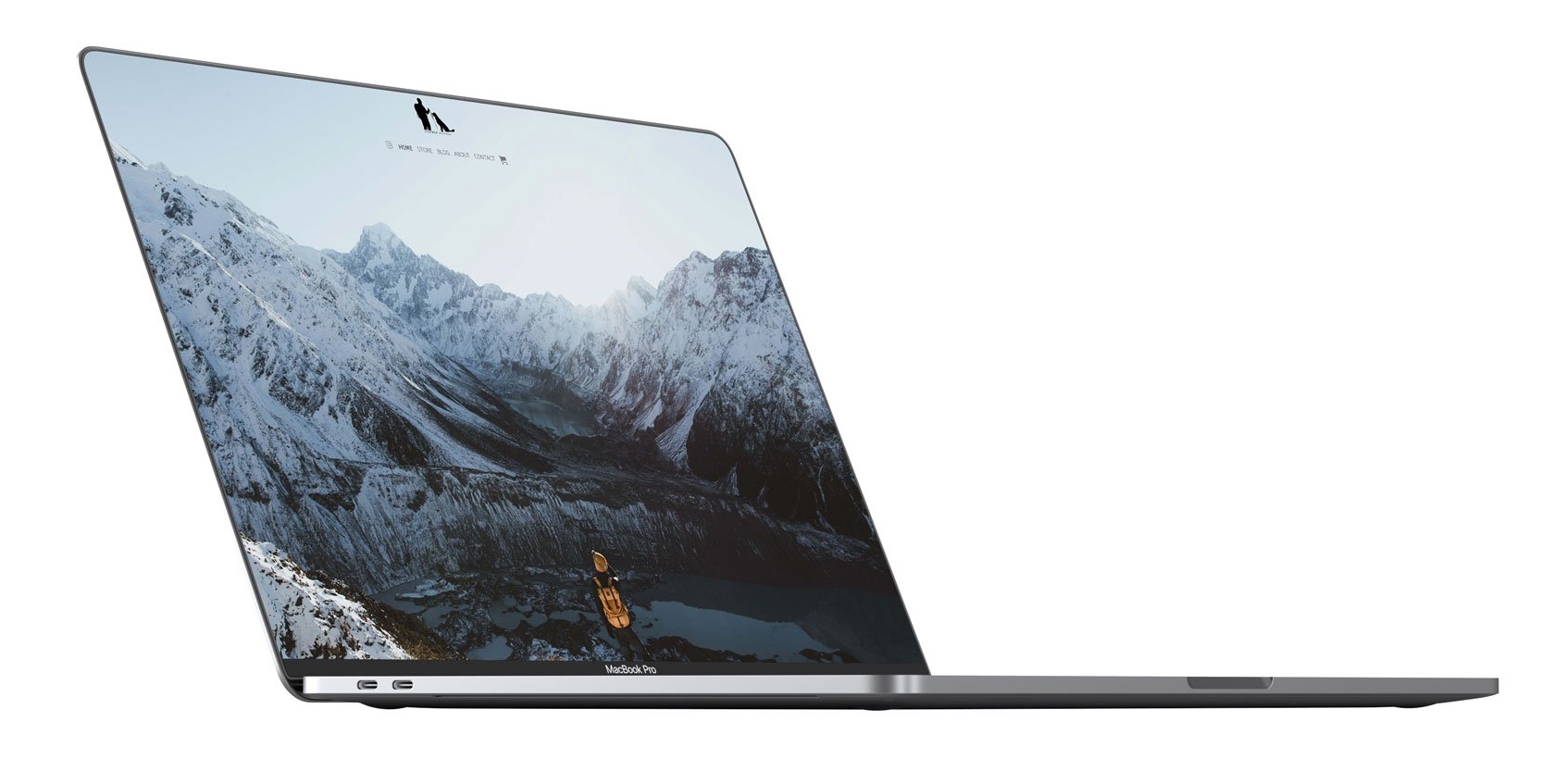
We build website using the WordPress platform but with a design that is completely custom. We start with an initial consultation to better understand your business goals and objectives.
You should join us.
We build website using the WordPress platform but with a design that is completely custom. We start with an initial consultation to better understand your business goals and objectives.
Gain a competitive edge, build credibility, loyalty and trust with consumers from the moment they lay eyes on you.
We build websites from the ground upwards, starting with your design. this whole process is revolved around your company and your business goals.
Whether you are a retailer aiming to survive in the digital age or an entrepreneur looking to capitalize on the countless opportunities in online sales, Lord Design has a host and e-commerce services to get your online store set up the right way.

Lord Design offers both responsive and dedicated mobile versions of your website to ensure your website is easy to use for visitors.
We understand that no two businesses are the same. We actively celebrate the unique DNA of your company and use that to spearhead those SEO Strategies accordingly.
Why have your domain name, hosting & other online services with different companies? Lord Design provides all of these online services in one easy place.
We look forward to hearing from you.